An Introduction to Visual Communication Analysis
How to Analyze the Political Meanings of Pictures and Moving Images.
Politics is about regulating societies. It is about institutions, decision-making, and legal codification. But maybe more importantly, politics is about communicating. Whenever a political leader gives a speech, a talk-show discusses current affairs, or a public service announcement explains how to prevent a communal disease, we see political communication in action. To analyse such processes, scholars often focus on what is said or written, which is a useful focus if you are trying to explore the statements political actors make on a subject, or what rhetoric they deploy. Yet this focus on textual sources tends to side-step a dimension of political communication that is highly important, particularly in an age of mass-media: the visual. That is why, in this post, I expand the toolbox for discourse analysis that I have introduced in a previous post by adding methods and work-steps that will hopefully not only inspire you to explore how politics play out through different media in a wide range of context, but will also provide you with advice for conducting your own visual communication analysis.
I will start by first looking at various issues that I think are worth keeping in mind when exploring visual political communication. This will include questions like: how do I approach a political image? And what aspects of a picture matters in an analysis? I’ll then move on to discuss more complex forms of visual communication, such as films, media events, theme parks, and political exhibits. What changes about the political image when it becomes animated, or when it is juxtaposed with sounds? What happens when political communication plays out in a three-dimensional space, such as a museum? Using practical examples along the way, I will introduce you to tools that you can use if you want to break down these complex communication processes and check how they work. I will conclude by discussing what you might want to keep in mind as you present the results of your visual communication analysis, whether in textual form or by using your own visualizations.
Preparing a visual communication analysis
I have argued in another post that communication is a fundamental human process that works according to general mechanisms that we can explore systematically. If you generally agree with this sentiment, you will not find it surprising that I think we can and should ally different theories of communication with each other to capture the various aspects of the communication process that they each explore. For instance, I would argue that discourse theory can be readily linked to the theory of semiotics. Discourse theory asks how certain statements shape commonly accepted truths in a society, and how power relations influence the ways in which such statements are formed, how they are spread, and how they end up reinforcing existing institutions or “crystallising” into new ones. Semiotics, on the other hand, provides an account of how actors deploy the “micro” elements of communication to create messages – often with exactly the kind of discursive effects that discourse analysts look for. It is precisely such a combination of discourse analysis and semiotics that has led to successful and highly prolific collaborations between communication scholars such as Gunther Kress and Theo van Leeuwen (e.g. 2001, 2006), and I can highly recommend you look at some of their work.
Setting up a visual communication analysis is not that different from setting up a discourse analysis. The most important thing is asking the right questions, and then critically and systematically looking at materials that promise to answer those questions. You might be interested, for example, in how a specific newspaper uses images to portray a specific political event in a particular light. This is the kind of work that Marion Müller has conducted on the famous (some might say: infamous) German tabloid BILD. Müller (2003: 84-85) shows how this highly influential paper uses photos from different camera angles, depending on the political position the editors are trying to convey. For instance, when the BILD uses images of people who have died as the outcome of violent conflicts, it shows profile shots of those it depicts as perpetrators while showing frontal shots of those who it portrays as victims. The first choice creates a distance between viewer and object, the second choice prompts viewers to empathise. A closer look at the visual properties of the images in question can help uncover such underlying mechanisms. Take a look at the box for the various elements of an image that are worth paying attention to in such contexts. [grid_6] [frame_right]
What’s in an image?
- Angle
- Colour scheme
- Lighting
- Mise-en-scène (arrangmenet of persons and objects in the scene)
- Actions or demeanour of persons depicted in the image. [/frame_right] [/grid_6]
There are many such examples of manipulative image use. Think of the way in which press outlets in Europe and the US depicted the 2008 riots in Tibet. Many papers and TV stations, like CNN, used edited images or photos from other countries to depict allegedly Chinese public security forces beating Buddhist monks. The images worked together with the articles and news reports to construct an overarching narrative of an authoritarian regime oppressing non-violent religious protesters. Regardless of how you feel about the event itself, the way in which these image manipulations fuelled and sustained anti-Chinese sentiments in the run-up to the Beijing Olympics is worth analysing, as is the reaction of the critics from China, who used these and other images to create their own rhetorical counter-arguments about what the “truth” of the matter was (note: this video may not display properly on all computers). In such a case, a good analysis is likely to look not only at the content of an image, but also at the production background, the technical parameters of the original (if such an original is available), and the way in which the image was ultimately deployed in a certain context.
But visual analysis does not need to be solely about image manipulation. Maybe you are hoping to find out what role a specific recurring visual trope plays in a political context. This would be the kind of question that the political iconographer Aby Warburg advocated in the 1920s, and which continues to inspire visual research like the VisComX project in Germany.

[grid_7] [frame_left]
Questions to ask of an image:
- Who is the producer?
- In what context does the image appear?
- What are the technical parameters of the original?
- What kind of different versions are in circulation?
- What symbols or tropes does the image deploy?
- Does the image make use of cultural references?
- How does the image interact with other pieces of information (headlines, captions, etc.)? [/frame_left] [/grid_7]
To give you an example from East Asia, my colleague Hwang Yih-Jye and I have recently looked at the way in which different media depicted the Wenchuan Earthquake that hit China’s Sichuan province in 2008 (Schneider & Hwang, 2014a). We were able to show that diverse media products, ranging from films and documentaries to theatre performances and exhibits, used two recurring visual metaphors: battered hands reaching out of the rubble for help, and aid workers carrying quake victims across mountains of debris. We argued that the ubiquity of these two tropes made them ideal tools for different political actors to appeal to their audience’s sense of patriotism. What is worth checking in such contexts is the “intertextual” use of specific symbols, for example of outstretched hands, which in this case also play an important role in the official propaganda rhetoric of the Chinese Communist Party. In other words, it can be fruitful to trace the use of a visual element across media types, between institutional settings, and over time. The box on the left contains a number of such issues that may be worth considering when working with images.
How to approach the political image
I have so far given you suggestions as to what questions to ask, and what factors of visual communication might be worth your attention. But what does an actual analysis consist of? A useful approach is to try and break down the image into its different components, and to check how each contributes to the overall meaning and relevance of that image. You may want to list the various components that make up the image, such as angle, colour scheme, and lighting. You could add to such a list the major signs that the image itself contains (e.g. a gun, a car, a siren, a man, a black uniform, etc.). In short: your first order of business is to describe the image. This may seem like a trivial task, but can in fact be quite a challenge. Müller (2003) suggests, as a heuristic activity, that we try and separate our description from our explanation and our interpretation. This is a very valuable exercise, because it highlights at which point of the viewing process you are inclined to jump to conclusions. The exercise not only trains you to take an (arguably artificial) “neutral” point of view, so as to retain your critical distance during your analysis, it also raises new questions: did you have difficulty describing a specific element of an image in neutral terms? If so, why? For instance, what is it that might make you identify a man in a black uniform as “a police officer”? What part of a podium in front of a flag might make you think “white house press room”?
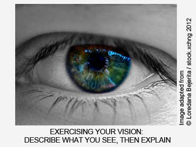 In short, your job at the start of a visual analysis is to force yourself to acknowledge your own biases, and to check how the use of an image capitalizes on these biases to convey meaning in a specific context. I can encourage you to try this exercise yourself: the next time you read your favourite news website, take a look at the image that “sells” the story. Then go through the following three steps:
1) Description: describe the image in as much detail as you can, but without attributing meaning to the various elements.
2) Explanation: now bring the meanings back in and explain what the different elements stand for. Also, see if you can figure out how these elements relate to one another. In other words, you are now asking: how does the image “work”?
3) Interpretation: try to relate the image to the context you found it in. Does the meaning that you identified in the second step of your analysis hinge on the way the image is presented (for instance its caption, the article’s headline, or other images next to it)? What cultural and historical information is necessary to “get” the image? Do any social values or norms influence the way you interpret the image, for instance by guiding you to make a specific moral judgement?
Again, remember that these three steps are artificial. We do not normally view images in this way. What this exercise is meant to achieve is help you develop your visual literacy. It is meant to help you work your way through your visual material systematically and avoid getting seduced by the very processes you are trying to uncover. If you take notes at each step, you should be able to formulate results that are based on evidence, demonstrating with confidence that you did not cut any corners.
Working with moving images
The basic set-up of a visual analysis remains the same as the communication process becomes more complex. Whether you are examining a single image, a short video, or a feature-length movie, it makes sense to ask about the production background, the technical specifics of the medium, the genre conventions, the socio-historical context, and so on. It also makes sense to try and describe first, then explain, and finally interpret your visual material. What differs, however, are the elements that are worth looking for in such material, as well as the ways to document them.
Moving images add two important new elements to the communication process. The first is time: a film is dynamic, making its statements in series of shots, often across different scenes or narrative sequences. The second element is sound: most movies contain speech as well as acoustic effects, and even silent movies tend to deploy music to disambiguate the images. In other words, film combines several modes of communication: the visual, the acoustic, and possibly the verbal.
In order to capture the dynamic and “multi-modal” nature of moving images, researchers in film studies use visual protocols (Iedema 2001, Katz 1991, Korte 1999, Phillips 2002). The most common kind is the shot protocol, which is essentially a reverse-engineered story board. The shot protocol is a table that lists every separate camera shot, in chronological order. You can easily create such a table in Excel or Numbers. Each line is reserved for a shot, and the various columns allow you to capture all the data that you need. Below is a section of a shot protocol that I created for the analysis of a Chinese television drama. As you can see, the table contains the shot number, a screen-shot, the length of the shot, a short-hand notation on the angle and the camera actions (e.g. “medium close-up” at “eye-level angle” with a “tilt up”), a short verbal description of the shot, notes on acoustics, and a transcript of the spoken text (both the Chinese original, and my English translation). Depending on your material and your questions, you could delete some of these columns or add new ones, for instance to note colour symbolism, the use of certain mise-en-scéne artefacts, etc.
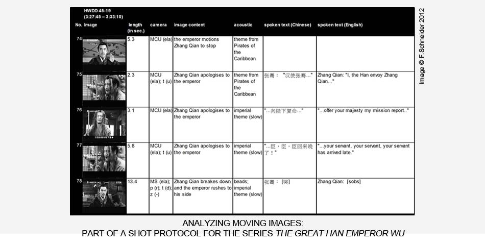
An advantage of this kind of shot protocol is that it captures how different elements work together in a dynamic sequence of images. For instance, the shot length helps highlights where the emphasis might lie in a sequence of shots, and what elements interact in that moment. Here, shot 78 is a particularly lengthy shot that concludes a series of fast-past shots. The narrative arc culminates with a character breaking down in violent sobs in front of his emperor. The emotional force of the scene is an outcome of visual and acoustic construction that the protocol helps depict and explore. In this particular case, the protocol is part of a larger analysis that shows how this Chinese TV programme makes highly political (and ultimately very conservative) statements on what it means to be a good ruler (cf. Schneider 2012).
Not all moving images are best summarized in a shot protocol. If you are not interested in the detailed dynamics of a scene, but want to capture the overall narrative arcs and patterns in a lengthy film, then a better choice might be to create a sequence protocol. The idea behind a sequence protocol is the same as for the shot protocol: it is a way to document the dynamics of a visual product, and to systematically capture the elements that promise to answer your question. I use sequence protocols to divide films and theatrical performances into narrative elements that I can then code for certain discourses. I can then later find all sections of the visual material that, for example, are set in a specific location, contain a specific character, use a particular piece of music, or deal with a specific subject matter. Also, the protocol can again help highlight patterns in the material. For instance, my colleague and I recently analysed a Chinese documentary that recounts China’s modern history, from the Opium Wars to today (Schneider & Hwang, 2014b). The sequence protocol showed that the documentary repeatedly deployed the same general set-up to convey its highly ideological narrative. It combined special effects, images of historical artefacts, carefully edited expert interviews, and selected film scenes to suggest a high degree of factuality, all the while imbuing the account with a strong sense of pathos.
Other forms of visual communication
Protocols can also help capture visual communication processes that are even more complex than film, such as museums, parades, political rallies, and so on. In such cases, there are often additional dimensions to the communication process which deserve being analysed. An exhibition, for example, might be broken down into its separate exhibits, but a “sequence protocol” may not be the best way to capture how these exhibits are located in space, particularly if there is more than one way to move through the exhibition. This is where you will need to be creative. Maybe a map of the exhibition’s layout will help you explore what logic governs the way the individual exhibits are arranged and connected. Alternatively, a decision-tree could highlight how visitors can move through the exhibits. The method of analysis will again depend on the kind of question you have.
The trick for such an analysis is to find a way to connect the different bits of your data in a way that allows you to explore different dimensions of your case to see what logic applies and what patterns emerge. There are various tools that make it possible to relate diverse research materials to one-another. For instance, the research software NVivo allows you to create network maps of different data elements (for instance if you need to compile all the images associated with a particular event). However, if your university does not offer this programme or a similar one, then you can still fall back on one of the many free tool that are available online. I can recommend the browser-based software Prezi. While Prezi is designed primarily for presentations, it can also be re-appropriated for research purposes. Prezi is essentially a large, visually oriented mind-mapping tool. You can upload various bits of data, such as individual images, pdf versions of protocols, etc, and then arrange these elements on an empty canvas. You could, for instance, start with a 2D map of a theme park and then add photos of each ride or exhibit to that map. The zoom-function is a good way to then “walk” your way through such a virtual version of your data, and the programme allows you to take notes along the way. You may need to conduct any quantitative research separately (for instance if you wanted to calculate the floor-space of the different exhibits), but Prezi nevertheless offers a convenient way to arrange your data. What is more, after you have concluded your analysis, you can use the same canvas in your presentations.
Conclusion: visualizing your visual analyses
As the example of Prezi already suggests, your research presentation will ultimately be well served if you are able to showcase your materials. After all, showing your audience the images that you are discussing is a compelling way to demonstrate your case. The same is true for the tools you use to analyse images. A shot protocol is not only helpful because it is “searchable”, or because it allows you to calculate shot frequencies, total length of a scene, or other quantitative aspects of your data. It is also a visual representation of your research, which makes it a powerful part of your argument.
However, this is also where the risk lies. Visualizing your data is not a trivial process. Just like newspapers may use photos to make a rhetorical argument, and may manipulate readers with the idea that a visual representation is particularly unbiased and “true” (Gombrich 1980), so too can visualized research data be deployed to manipulate the audience. For instance, if I shower my critics with graphs and figures to obscure the fact that I didn’t ask any valid questions of my material, then I am no longer conducting sound research. Similarly, if I condense a complex process into a simplified visual representation that misleadingly emphasises the wrong elements, then I am doing violence to my data. In the best of cases, I am only doing a poor job. In the worst of cases, I am producing ideology rather than research.
The important thing to remember is that any kind of research presentation is always also an argument. A written account of a historical event or a mathematical calculation of an economic process can be just as misleading and manipulative as the visual examples I offer above. So what separates a good research account from a bad one?
I believe the answer is honesty and clarity. If you are transparent about your research process, about the assumptions that informed your approach, and about the limitations of your tools, then you are already guarding yourself against temptations to misrepresent your own work. If you are able to then communicate your results clearly, in ways that allow others to look at your work, understand what it is you did, and reproduce your results (or refute them), then a visual rendition of your work is no less worthy of scholarly attention than any academic monograph.
References
Gombrich, E. H. 1980. “Standards of Truth: The Arrested Image and the Moving Eye”. In Mitchel, W. J. Thomas (ed.): The Language of Images. 4th ed., Chicago: The University of Chicago: 181-217.
Iedema, Rick. 2001. “Analysing Film and Television: a Social Semiotic Account of Hospital: an Unhealthy Business”. In Van Leeuwen, Theo & Jewitt, Carey (eds.): Handbook of Visual Analysis. London et al.: SAGE: 183-204.
Katz, Steven D. 1991. Film Directing Shot by Shot: Visualizing from Concept to Screen. Studio City: Michael Wiese Productions.
Korte, Helmut. 1999. “Filminterpretation – Filmanalyse (Film Interpretation – Film Analysis)”. In Hoffmann, Wilhelm (ed.): Die Sichtbarkeit der Macht. Theoretische und empirische Untersuchungen zur visuellen Politik. (The Visibility of Power. Theoretical and Empirical Analyses Concerning Visual Politics.) Baden-Baden: Nomos Verlagsgesellschaft: 76-90.
Kress, Gunther & Van Leeuwen, Theo. 2001. Multimodal Discourse – The Modes and Media of Contemporary Communication. London: Arnold.
Kress, Gunther & Van Leeuwen, Theo. 2006. Reading Images: The Grammar of Visual Design. 2nd ed., Abingdon & New York: Routledge.
Müller, Marion G. 2003. Grundlagen der visuellen Kommunikation (Basics of Visual Communication). Konstanz: UVK.
Phillips, William H. 2002. Film: An Introduction. 2nd ed., Boston & New York: Palgrave.
Schneider, Florian. 2012. Visual Political Communication in Popular Chinese Television Series. Leiden & Boston: Brill.
Schneider, Florian & Hwang, Yih-Jye. 2014a. “The Sichuan Earthquake and the Heavenly Mandate – Reaffirming China’s Developmental Model through Disaster Discourses”. Journal of Contemporary China, 23(88), 636-656.
Schneider, Florian & Hwang, Yih-Jye. 2014b. “China’s Road to Revival – ‘Writing’ the PRC’s Struggles for Modernization”. In Cao, Qing, Tian, Hailong, & Chilton, Paul (eds.). Discourse, Politics and Media in China. Amsterdam et al.: John Benjamins: 145-170.
Share This Post, Choose Your Platform!
About the Author: Florian Schneider
3 Comments
Comments are closed.
[…] in methodological tools for studying multi-modal communication, take a look at my practical tips on how to conduct a visual communication analysis. For now, I hope to have inspired you to take notice of the various signs that you are confronted […]
[…] For scholars interested in digital media content, methods might include discourse analysis, visual communication analysis, iconography, and various tools adopted from the study of literature, art, and culture. This was […]
[…] to prepare the material for analysis and interpret her data. She decides that this will include creating sequence protocols of the news broadcasts, and then providing shot protocols for particularly important […]